Electric Vehicle Charging Infrastructure in the U.S.: An Analysis, and a Consumer Tool
By Dan Pacheco
Final Project for IST 687: Introduction to Data Science
Syracuse University iSchool Masters in Applied Data Science Program
Friday, Mar. 21, 2025
This paper is also available online here: https://pachecod.github.io/ist687final/
Sections: Introduction | Data Sources | Importing & Cleaning | Maps | Top Facility Types | Regression Analysis | EV Road Trip Planner | Github Repository
Introduction
As interest in electric vehicles (EVs) grows, so does concern about charging infrastructure. And this is backed up by recent research. A recent Harvard study showed that drivers can successfully recharge their cars using non-residential EV equipment only 78% of the time. Potential buyers (myself included!) worry about where and how often they can charge on the road — especially when leaving urban areas. The most extreme example of this is planning a road trip. Unless every American plans to have a combustion-engine car for road trips and an electric car for city driving only, this is a problem that must be solved.
This project examines how EV charging is distributed across the U.S. and what kind of experience drivers can expect based on where they live or plan to travel. I used R Studio and the functions and processes I learned in IST 687: Introduction to Data Science to try to get a better picture of what the charging infrastructure across the United States is really like, and began building a Shiny App using Leaflet.js that could potentially help EV road-trippers plan their trips with more confidence. I was super excited to learn that Leaflet is supported natively in R using a package! I have more about that in an Appendix at the end of this writeup.
Data Sources
The data for this project comes from the U.S. Department of Energy's Alternative Fueling Station Locator web site. This data set covers all types of alternative fuels including things like hydrogen fuel, but I wanted to focus only on electric vehicles. I was able to download a subset of 83,000+ records of EV charging stations nationwide, as well as in Canada and some U.S. territories. I filtered the dataset to focus solely on electric vehicle stations.
Because the Trump Administration has recently been haphazardly deleting federal data sets that it thinks are at odds with its preference for fossil fuel energy, I made a copy of this export in Google Sheets so that it will always be available (and available for my final project). I also have all of the data and code in a Github Repository.
Other data sources include:
- State population data (
state.x77) - EV registrations by state (DOE)
- U.S. map data from R's
mapspackage
Importing and Cleaning the Data
I used the jsonlite library for importing the CSV, and the tidyverse library for subsetting and cleaning it to be in the formats I needed. I also renamed the column headers for the columns I planned to use.
A key point of cleaning is that I needed to remove Canadian provinces, the District of Columbia and Puerto Rico because the ggplot maps I'm using don't display those locations. I also wanted to compare only states to other states. However, I did copy the states data into its own US file, with a plan of eventually creating a subset of just Canada, and perhaps also a subset that is only the island of Puerto Rico so that I can do analyses of them individually, and even compare them to U.S. states.
# Load libraries
library(tidyverse)
library(jsonlite)

# Load the raw dataset
fuelstations <- read.csv("altfuelstations.csv", header = FALSE)

# Rename relevant columns
colnames(fuelstations)[1] <- "FuelTypeCode"
colnames(fuelstations)[2] <- "StationName"
colnames(fuelstations)[5] <- "City"
colnames(fuelstations)[6] <- "StateAbbrev"
colnames(fuelstations)[25] <- "Latitude"
colnames(fuelstations)[26] <- "Longitude"
colnames(fuelstations)[33] <- "OpenDate"
colnames(fuelstations)[38] <- "ConnectorTypes"
colnames(fuelstations)[48] <- "FacilityType"

# Remove duplicate header row
fuelstations <- fuelstations[-1, ]

# Filter out non-U.S. entries
canadian_codes <- c("AB","BC","MB",...)
fuelstations_us <- fuelstations[!(fuelstations$StateAbbrev %in% canadian_codes), ]
fuelstations_us <- fuelstations_us %>% filter(StateAbbrev != "DC")
Mapping the Charging Landscape
Map 1: Total Stations by State
My first map was showing the total number of stations across every state. I had to first count the number of fuel stations and tie those to state abbreviations. I then joined it with the map data so that I could use ggplot2.
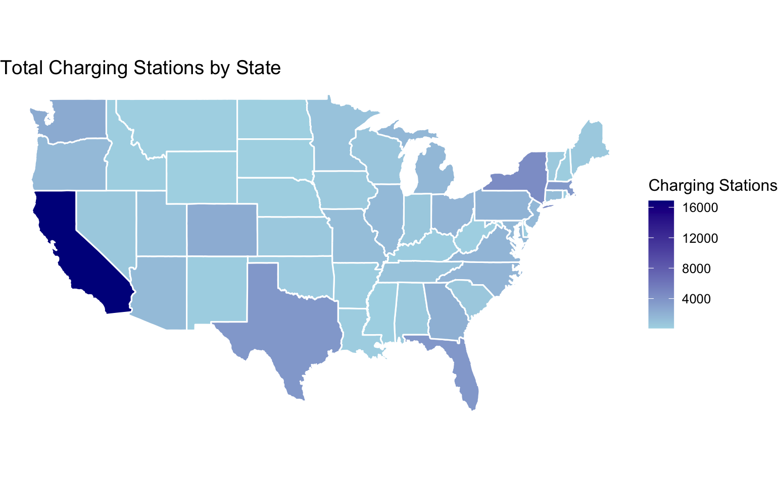
Code for the map above:
# Count stations per state
state_counts <- fuelstations_us %>%
  group_by(StateAbbrev) %>%
  summarise(StationCount = n())

# Join with map data
state_data <- state_counts %>%
  left_join(data.frame(StateAbbrev = state.abb, region = tolower(state.name)), by = "StateAbbrev")
map_data_final <- left_join(map_data("state"), state_data, by = "region")

# Plot
ggplot(map_data_final, aes(x = long, y = lat, group = group, fill = StationCount)) +
  geom_polygon(color = "white") +
  scale_fill_gradient(low = "lightblue", high = "darkblue") +
  coord_fixed(1.3) +
  theme_void() +
  labs(title = "Total Charging Stations by State")
Map 2: With California Removed
This map lets you see more clearly how the other states compare. Texas, New York, Massachusetts and Florida are all on par numerically. States like Washington, Georgia, North and South Carolina, Colorado, Pennsylvania and Michigan make the middle tier. The rest are at the bottom. (But don't feel too big in your britches, mid-levels, because you are all still way way WAY behind California!)
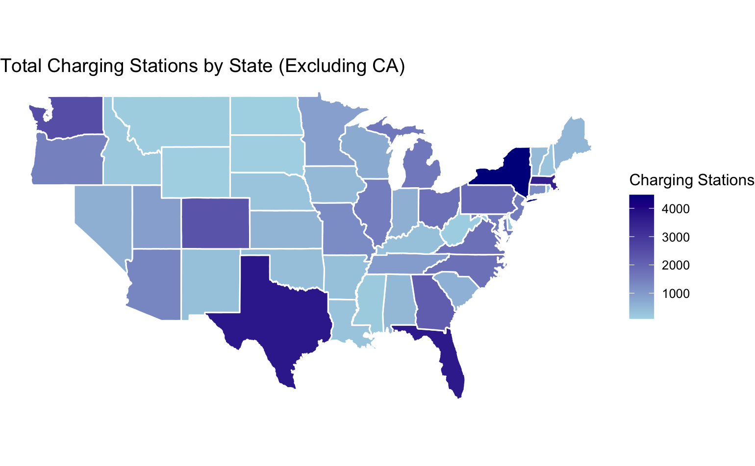
Code for the map above:
map_data_no_ca <- map_data_final %>% filter(region != "california")
ggplot(map_data_no_ca, aes(x = long, y = lat, group = group, fill = StationCount)) +
  geom_polygon(color = "white") +
  coord_fixed(1.3) +
  theme_void() +
  labs(title = "Charging Stations by State (Excluding California)")
Map 3: Stations Per Capita
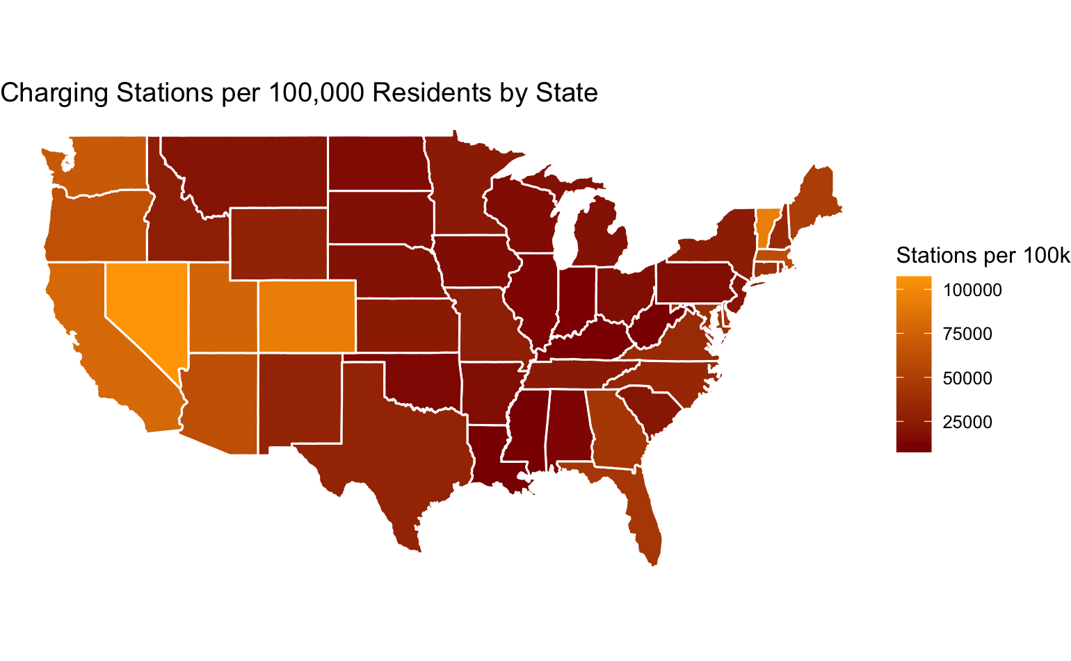
As I thought more about what these numbers mean, the total number is not that useful because every state has differently sized populations. I decided to import a dataframe of state population size, then join that into the data of totals per state. This allowed me to show the total number of charging stations per 1,000 residents.
This led to some interesting insights. As compared to their populations, California, Washington, Oregon, Utah, Colorado, Arizona, and Vermont are actually on par with each other. So California, you're not as far ahead of every state as you thought. And surprise: Nevada is ahead of everyone, including California!
Code for the map above:
new_state_population <- data.frame(region = tolower(rownames(state.x77)), Population = state.x77[,"Population"])
new_state_data <- state_data %>%
  left_join(new_state_population, by = "region") %>%
  mutate(StationsPer100k = (StationCount / Population) * 100000)

new_map_data_final <- left_join(map_data("state"), new_state_data, by = "region")

# Plot
ggplot(new_map_data_final, aes(x = long, y = lat, group = group, fill = StationsPer100k)) +
  geom_polygon(color = "white") +
  scale_fill_gradient(low = "darkred", high = "orange") +
  coord_fixed(1.3) +
  theme_void() +
  labs(title = "Charging Stations per 100,000 Residents")
Map 4: Stations Per Electric Vehicle
All this made me think even more about the average experience of an electric car driver. Do you care how many charging stations there are as compared to the entire population? No, because you're competing for "pumps" with other electric car drivers. I think this is going to become a bigger and bigger issue as electric vehicles increase across the country due to how much longer it takes to charge your EV than it does a gas engine car.
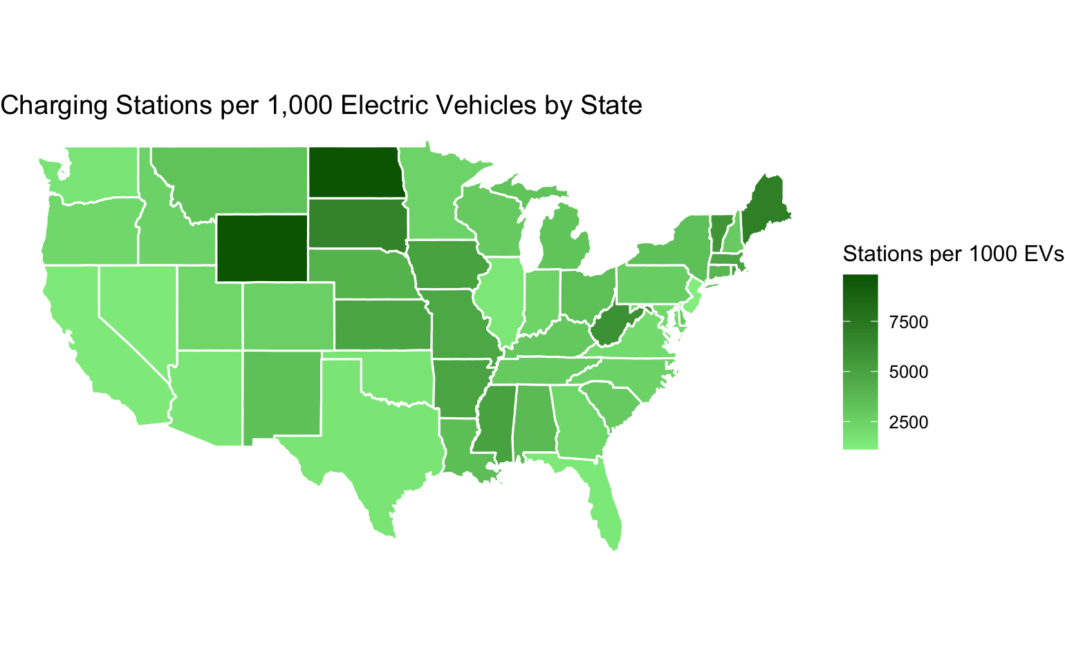
To get at this question, I pulled in a dataset from the Department of Energy that shows the number of registered electric vehicles per state. This allowed me to make a dataframe that can be used to show charging stations per electric vehicle owners in each state.
What I got was this map. It shows a more even distribution across the country, with some outliers. At first I thought it showed that Wyoming and North Dakota are ahead of others, and they are. But their populations are also just really small compared to the other states. However, there could be some bigger story there so I flagged it for future investigation.
Code for the map above:
carsbystate <- read.csv("vehicle_registration.csv", header = FALSE)
colnames(carsbystate) <- c("region", "electricvehicle")
carsbystate$region <- tolower(carsbystate$region)
carsbystate$electricvehicle <- as.numeric(gsub(",", "", carsbystate$electricvehicle))

new_state_ev_data <- state_data %>%
  left_join(carsbystate, by = "region") %>%
  mutate(StationsPer1000EVs = (StationCount / electricvehicle) * 1000)

new_map_ev_data <- left_join(map_data("state"), new_state_ev_data, by = "region")

# Plot
ggplot(new_map_ev_data, aes(x = long, y = lat, group = group, fill = StationsPer1000EVs)) +
  geom_polygon(color = "white") +
  scale_fill_gradient(low = "lightgreen", high = "darkgreen") +
  coord_fixed(1.3) +
  theme_void() +
  labs(title = "Charging Stations per 1,000 Electric Vehicles")
Where Are These Stations Located?
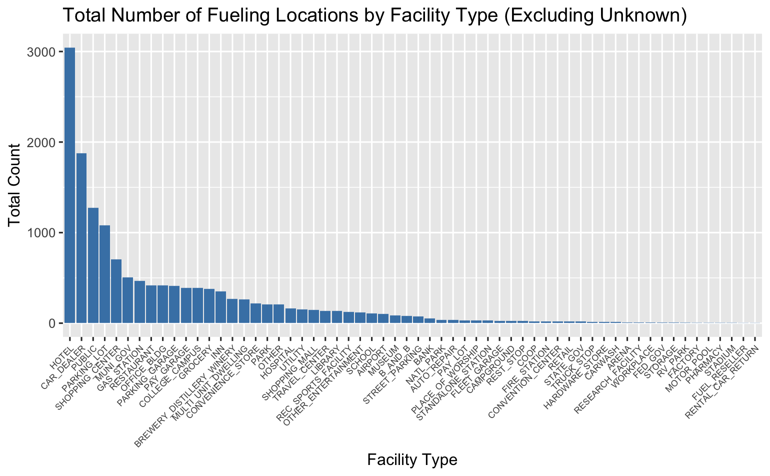
Enough with maps. Now I was ready to do some histograms. The one that made the most sense to me was this: what types of facilities tend to have the most charging stations? To get at that, I used the tidyverse piping function to mutate / group facility types and basically sum them up.
What I found is that approximately 16 facility types were leaders in having charging station, with hotels, car dealers, and "public" locations have the most. I am slightly concerned about the "public" designation because it may mean just unknown, but I need to do more research into that.
In a later step, I called out those 16 facility types to create an interactive map.
Code for the histogram:
facility_summary <- fuelstations_us %>%
  mutate(FacilityType = ifelse(FacilityType == "" | is.na(FacilityType), "Unknown", FacilityType)) %>%
  group_by(FacilityType) %>%
  summarise(Total = n()) %>%
  arrange(desc(Total))

ggplot(facility_summary, aes(x = reorder(FacilityType, -Total), y = Total)) +
  geom_bar(stat = "identity", fill = "steelblue") +
  labs(title = "Charging Stations by Facility Type") +
  theme(axis.text.x = element_text(angle = 45, hjust = 1))
Regression Analysis: Predicting Fast Charger Availability
Our professor wanted us to use predictive modeling if possible in this project. I thought a lot about what I could predict with the data I had. At first I wanted to try to predict which states were likely to have more stations based on their open dates. But this proved to be too much work, and I couldn't figure it out.
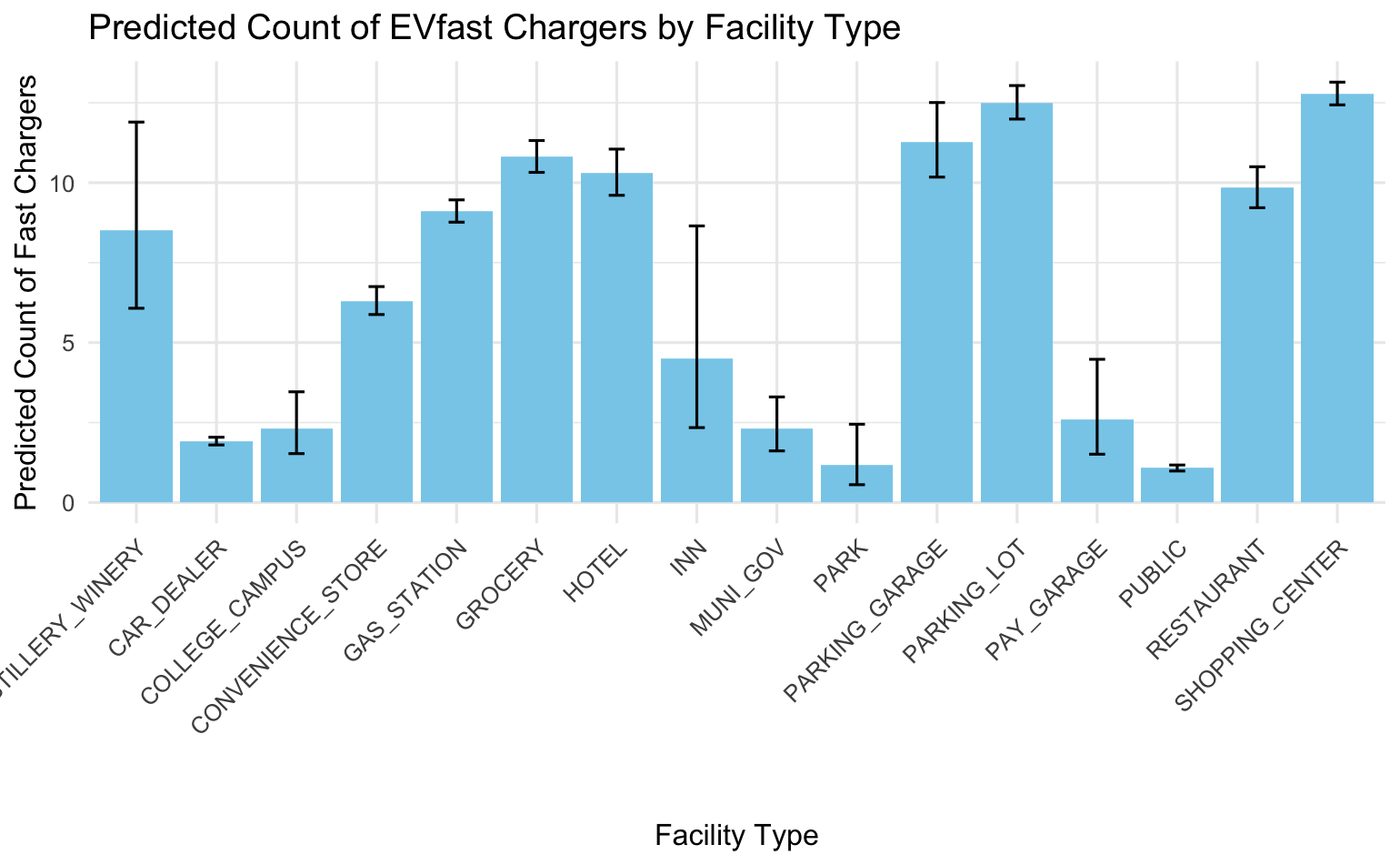
Instead, I found a way that I think predicts what each of the 16 top facility types are likely to have FAST chargers, as the data set has counts for how many chargers of different speeds are available at each location.
What it shows is that Distilleries and Wineries, Gas stations, Grocery stores, Hotels, Parking garages, parking lots, restaurants and shopping centers are more likely to have fast chargers. This makes sense, as those locations want you around just long enough to perform your task with them, and then they want you on your way.
Code for the predictive model:
# --- Step 1: Create the Binary Outcome Variable ---

# Assuming EVfast (or ev_dc_fast_num) represents fast chargers, convert it to numeric
fuelstations_us$EVfast <- as.numeric(fuelstations_us$EVfast)

# Create a new binary variable: has_fast (1 if there is at least one fast charger, 0 otherwise)
fuelstations_us <- fuelstations_us %>%
  mutate(has_fast = ifelse(EVfast > 0, 1, 0))

# --- Step 2: Filter for Relevant Facility Types ---
facility_types <- c("HOTEL", "CAR_DEALER", "PUBLIC", "PARKING_LOT", "SHOPPING_CENTER", "MUNI_GOV", "GAS_STATION", "RESTAURANT", "OFFICE_BUILDING", "PARKING_GARAGE", "PAY_GARAGE", "COLLEGE_CAMPUS", "GROCERY","INN","BREWERY_DISTILLERY_WINERY","CONVENIENCE_STORE","PARK")

fuelstations_filtered <- fuelstations_us %>%
  filter(FacilityType %in% facility_types)

# Check how many facility types are in the filtered dataset
table(fuelstations_filtered$FacilityType)

# --- Step 3: Split Data into Training and Test Sets ---
set.seed(123)  # For reproducibility
sample_size <- floor(0.7 * nrow(fuelstations_filtered))
train_indices <- sample(seq_len(nrow(fuelstations_filtered)), size = sample_size)
train_set <- fuelstations_filtered[train_indices, ]
test_set  <- fuelstations_filtered[-train_indices, ]

# Convert FacilityType to factor and drop unused levels in train_set
train_set$FacilityType <- droplevels(as.factor(train_set$FacilityType))
# Verify that FacilityType has more than one level
table(train_set$FacilityType)

# --- Step 4: Build a Logistic Regression Model ---
model <- glm(has_fast ~ FacilityType, data = train_set, family = "binomial")
summary(model)

# --- Step 5: Make Predictions and Evaluate ---
# Predict probabilities on the test set
predicted_probs <- predict(model, newdata = test_set, type = "response")
# Convert probabilities to binary predictions using a threshold of 0.5
predicted_classes <- ifelse(predicted_probs > 0.5, 1, 0)

# Use the caret package for an easy confusion matrix (install if necessary)
if (!require(caret)) {
  install.packages("caret")
  library(caret)
}

print("These reults indicate that all of my charging stations have fast chargers, so I can't use this regression model to determine anything useful")

# Change approach to instead precict the number of chargers of different speeds are likely to be at each facility type.

# --- Updated Code: Predicting the Count of Fast Chargers (EVfast) by FacilityType ---

# Make sure FacilityType is a factor in the overall dataset if not already done.
fuelstations_us$FacilityType <- as.factor(fuelstations_us$FacilityType)

# --- Step 1: Ensure EVfast is numeric ---
fuelstations_us$EVfast <- as.numeric(as.character(fuelstations_us$EVfast))

# --- Step 2: Filter for Relevant Facility Types ---
facility_types <- c("HOTEL", "CAR_DEALER", "PUBLIC", "PARKING_LOT", "SHOPPING_CENTER", "MUNI_GOV", "GAS_STATION", "RESTAURANT", "OFFICE_BUILDING", "PARKING_GARAGE", "PAY_GARAGE", "COLLEGE_CAMPUS", "GROCERY","INN","BREWERY_DISTILLERY_WINERY","CONVENIENCE_STORE","PARK")

fuelstations_filtered <- fuelstations_us %>%
  filter(FacilityType %in% facility_types)

# Check how many facility types are in the filtered dataset
table(fuelstations_filtered$FacilityType)

# --- Step 3: Split Data into Training and Test Sets ---
set.seed(123)  # For reproducibility
sample_size <- floor(0.7 * nrow(fuelstations_filtered))
train_indices <- sample(seq_len(nrow(fuelstations_filtered)), size = sample_size)
train_set <- fuelstations_filtered[train_indices, ]
test_set  <- fuelstations_filtered[-train_indices, ]

# Convert FacilityType to factor and drop unused levels in train_set
train_set$FacilityType <- droplevels(as.factor(train_set$FacilityType))
table(train_set$FacilityType)

# --- Step 4: Build a Poisson Regression Model ---
# We are predicting the count of EVfast chargers based on FacilityType.
model_poisson <- glm(EVfast ~ FacilityType, data = train_set, family = "poisson")
summary(model_poisson)

# Optionally, check for overdispersion:
# overdispersion <- sum(residuals(model_poisson, type = "pearson")^2) / df.residual(model_poisson)
# print(paste("Overdispersion:", overdispersion))
# If overdispersion is high (e.g., > 2), consider using a negative binomial model:
# library(MASS)
# model_nb <- glm.nb(EVfast ~ FacilityType, data = train_set)
# summary(model_nb)

# --- Step 5: Make Predictions and Evaluate the Model ---
# Predict counts on the test set using the Poisson model
predicted_counts <- predict(model_poisson, newdata = test_set, type = "response")

# Extract actual counts of EVfast from the test set
actual_counts <- test_set$EVfast

# Compute evaluation metrics: Mean Absolute Error (MAE) and Root Mean Square Error (RMSE)
MAE <- mean(abs(predicted_counts - actual_counts))
RMSE <- sqrt(mean((predicted_counts - actual_counts)^2))

print(paste("Mean Absolute Error (MAE):", MAE))
print(paste("Root Mean Square Error (RMSE):", RMSE))

# Now let's graph them.

# Generate new data for each facility type present in the training set
new_df <- data.frame(FacilityType = levels(train_set$FacilityType))

# Get predictions on the link scale along with standard errors
# Using type = "link" returns predictions on the log scale.
predictions <- predict(model_poisson, newdata = new_df, type = "link", se.fit = TRUE)

# Convert predictions and confidence intervals from log-scale to counts
new_df$fit <- exp(predictions$fit)
new_df$lower <- exp(predictions$fit - 1.96 * predictions$se.fit)
new_df$upper <- exp(predictions$fit + 1.96 * predictions$se.fit)

# Load ggplot2 (if not already loaded)
library(ggplot2)

# Create a bar plot with error bars for the predicted count of EVfast chargers
ggplot(new_df, aes(x = FacilityType, y = fit)) +
  geom_col(fill = "skyblue") +
  geom_errorbar(aes(ymin = lower, ymax = upper), width = 0.2) +
  labs(x = "Facility Type", y = "Predicted Count of Fast Chargers",
       title = "Predicted Count of EVfast Chargers by Facility Type") +
  theme_minimal() +
  theme(axis.text.x = element_text(angle = 45, hjust = 1))
Interactive Road Trip Planner (Shiny + Leaflet)
OK, so with all that out of the way, I started to get excited about what I could do to make these maps interactive. And I will admit: I had no idea, but I did know that Leaflet.js is used a lot by news organizations to make such maps.
So, I decided to go ask a new model of ChatGPT (the o3-mini-high model which is good at reasoning and code) if it knew of ways to do this. I specifically asked it: Based on the data set I had and the types of fields in it, did it know if it could use Leaflet to make a road trip planner?
It did, and the video below shows what we made together. I had to do some more data munging but was really excited to see that most of the code was supported directly in Leaflet's R package.
One part I designed myself was importing the geocoordinates of common locations for the Traveling From and Traveling To fields. If I were to spend more time on this, I would figure out a way for someone to type in any city in those fields, but I think it would require using an API and even paying for some geocoding services.
Try the Road Trip Planner on Shinyapps.io:
Code for the Leaflet road trip planner:
Road trip planner
    # Added an All for facility type, and default checked all types.

    library(shiny)
    library(leaflet)
    library(dplyr)
    library(stringr)
    library(sf)  # using sf as an alternative to geosphere

    # Make facility types characters for the shiny app. Later we need to make them factor for histograms.
    fuelstations_us$FacilityType <- as.character(fuelstations_us$FacilityType)

    # Create the city_coords data frame directly in the code
    city_coords <- data.frame(
      city = c(
        "Seattle, WA", "Denver, CO", "Los Angeles, CA", "San Diego, CA",
        "Chicago, IL", "Las Vegas, NV", "Albuquerque, NM", "New Orleans, LA",
        "Kansas City, KS", "Minneapolis, MN", "Miami, FL", "Orlando, FL",
        "Atlanta, GA", "Washington, DC", "New York, NY", "Syracuse, NY",
        "Honolulu, HI", "Key West, FL", "San Francisco, CA", "Nashville, TN",
        "Charleston, SC", "Aspen, CO", "Sedona, AZ", "Palm Springs, CA",
        "Myrtle Beach, SC", "Newport, RI",
        "Boston, MA", "Portland, OR", "Austin, TX", "Savannah, GA",
        "Scottsdale, AZ", "Lake Tahoe, CA", "San Antonio, TX", "Burlington, VT",
        "Santa Fe, NM", "Fort Lauderdale, FL"
      ),
      lat = c(
        47.6062, 39.7392, 34.0522, 32.7157,
        41.8781, 36.1699, 35.0844, 29.9511,
        39.1141, 44.9778, 25.7617, 28.5383,
        33.7490, 38.9072, 40.7128, 43.0481,
        21.3069, 24.5551, 37.7749, 36.1627,
        32.7765, 39.1911, 34.8697, 33.8303,
        33.6891, 41.4901,
        42.3601, 45.5152, 30.2672, 32.0809,
        33.4942, 39.0968, 29.4241, 44.4759,
        35.6870, 26.1224
      ),
      lon = c(
        -122.3321, -104.9903, -118.2437, -117.1611,
        -87.6298, -115.1398, -106.6504, -90.0715,
        -94.6275, -93.2650, -80.1918, -81.3792,
        -84.3880, -77.0369, -74.0060, -76.1474,
        -157.8583, -81.7800, -122.4194, -86.7816,
        -79.9311, -106.8175, -111.7609, -116.5453,
        -78.8867, -71.3128,
        -71.0589, -122.6784, -97.7431, -81.0912,
        -111.9261, -120.0324, -98.4936, -73.2121,
        -105.9378, -80.1373
      ),
      stringsAsFactors = FALSE
    )

    ### Updated geocode function that looks up coordinates from city_coords
    geocode <- function(address) {
      match_row <- city_coords[city_coords$city == address, ]
      if (nrow(match_row) > 0) {
        return(c(lat = as.numeric(match_row$lat), lon = as.numeric(match_row$lon)))
      } else {
        # Default: approximate center of the US if address not found
        return(c(lat = 39.8283, lon = -98.5795))
      }
    }

    ### Assume fuelstations_us is already loaded and cleaned, with required columns,
    ### including: Latitude, Longitude (numeric), FacilityType, ConnectorTypes, etc.
    ### Also assume that binary connector columns (e.g. "CHADEMO", "J1772", etc.) have been created.
    unique_connectors <- c("CHADEMO", "J1772", "J1772COMBO", "TESLA", "NEMA515", "NEMA1450", "NEMA520")

    ui <- fluidPage(
      tags$head(
        tags$style(HTML("
          .well { margin-bottom: 15px; }
          .help-text { font-size: 0.9em; color: #555; }
        "))
      ),
      titlePanel("Road Trip Planner for EV Charging & Fun Stops"),
      sidebarLayout(
        sidebarPanel(
          wellPanel(
            h4("Trip Settings"),
            selectInput("origin", "Leaving from:",
                        choices = city_coords$city, selected = "New York, NY"),
            selectInput("destination", "Driving to:",
                        choices = city_coords$city, selected = "Washington, DC")
          ),
          wellPanel(
            h4("Filter Options"),
            selectInput("state", "State:",
                        choices = c("All", sort(unique(fuelstations_us$StateAbbrev))),
                        selected = "All"),
            # Multi-select for Facility Type using selectizeInput with remove_button plugin
            selectizeInput("facility", "Facility Type:",
                           choices = c("All", sort(unique(fuelstations_us$FacilityType))),
                           selected = "All", multiple = TRUE,
                           options = list(plugins = list("remove_button"))),
            checkboxGroupInput("connectors", "Connector Types:",
                               choices = unique_connectors,
                               selected = unique_connectors)  # all default checked
          ),
          actionButton("plan", "Plan My Route"),
          br(), br(),
          helpText("Use the controls above to filter charging stations along your route.
                   The map will update with locations and available amenities.", class = "help-text")
        ),
        mainPanel(
          leafletOutput("map", height = 600)
        )
      )
    )

    server <- function(input, output, session) {
      # Reactive subset based on filters
      filteredData <- reactive({
        data <- fuelstations_us
        if (input$state != "All") {
          data <- data %>% filter(StateAbbrev == input$state)
        }
        # If "All" is selected in facility, do not filter by facility type.
        if (!("All" %in% input$facility)) {
          data <- data %>% filter(FacilityType %in% input$facility)
        }
        if (!is.null(input$connectors) && length(input$connectors) > 0) {
          data <- data %>% filter(if_any(all_of(input$connectors), ~ . == 1))
        }
        data
      })

      # Render the base Leaflet map
      output$map <- renderLeaflet({
        leaflet() %amp;%
          addProviderTiles("CartoDB.Positron") %amp;%
          setView(lng = -98.583, lat = 39.833, zoom = 4)  # Center on the US
      })

      # Update map markers when filters change using marker clustering
      observe({
        data <- filteredData()

        leafletProxy("map", data = data) %amp;gt;%
          clearMarkers() %amp;gt;%
          clearMarkerClusters() %amp;gt;%  # Clear clusters before adding new ones
          addMarkers(~Longitude, ~Latitude,
                     popup = ~paste("<strong>", StationName, "</strong><br/>",
                                    StreetAddress, "<br/>",
                                    City, ", ", StateAbbrev, "<br/>",
                                    "Facility: ", FacilityType, "<br/>",
                                    "Connectors: ", ConnectorTypes),
                     clusterOptions = markerClusterOptions()
          )
      })

      observeEvent(input$plan, {
        # Geocode the selected origin and destination
        origin_coords <- geocode(input$origin)
        destination_coords <- geocode(input$destination)

        # Calculate a bounding box around the route with a 1-degree buffer
        min_lat <- min(origin_coords["lat"], destination_coords["lat"]) - 1
        max_lat <- max(origin_coords["lat"], destination_coords["lat"]) + 1
        min_lon <- min(origin_coords["lon"], destination_coords["lon"]) - 1
        max_lon <- max(origin_coords["lon"], destination_coords["lon"]) + 1

        # First filter charging stations by facility type and bounding box
        stops_data <- fuelstations_us %amp;%
          filter(FacilityType %in% input$facility,
                 Latitude >= min_lat, Latitude <= max_lat,
                 Longitude >= min_lon, Longitude <= max_lon)

        # Further filter by selected connector types using binary columns
        if (!is.null(input$connectors) && length(input$connectors) > 0) {
          stops_data <- stops_data %amp;% filter(if_any(all_of(input$connectors), ~ . == 1))
        }

        # Use sf to refine by selecting stations that are "near" the route
        # Create a LINESTRING from origin to destination
        line_coords <- matrix(c(origin_coords["lon"], origin_coords["lat"],
                                destination_coords["lon"], destination_coords["lat"]),
                              ncol = 2, byrow = TRUE)
        route_line <- st_sfc(st_linestring(line_coords), crs = 4326)

        # Convert stops_data to an sf object
        stops_sf <- st_as_sf(stops_data, coords = c("Longitude", "Latitude"), crs = 4326)

        # Compute distances (in meters) from each station to the route
        distances <- st_distance(stops_sf, route_line)

        # Set a threshold (e.g., 50 km = 50000 meters) and filter
        threshold <- 50000
        stops_data <- stops_data[as.numeric(distances) <= threshold, ]

        # Create a color palette for facility types
        pal <- colorFactor("Set1", domain = unique(stops_data$FacilityType))

        # Render the Leaflet map with route and station markers
        output$map <- renderLeaflet({
          leaflet() %amp;%
            addProviderTiles("CartoDB.Positron") %amp;%
            setView(lng = mean(c(origin_coords["lon"], destination_coords["lon"])),
                    lat = mean(c(origin_coords["lat"], destination_coords["lat"])), zoom = 7) %amp;gt;%
            # Add markers for origin and destination
            addMarkers(lng = origin_coords["lon"], lat = origin_coords["lat"], popup = "Origin") %amp;gt;%
            addMarkers(lng = destination_coords["lon"], lat = destination_coords["lat"], popup = "Destination") %amp;gt;%
            # Draw a polyline connecting origin and destination
            addPolylines(lng = c(origin_coords["lon"], destination_coords["lon"]),
                         lat = c(origin_coords["lat"], destination_coords["lat"]),
                         color = "blue", weight = 3, opacity = 0.7) %amp;gt;%
            # Add charging station markers (circle markers) with popups showing amenities
            addCircleMarkers(data = stops_data,
                             lng = ~Longitude,
                             lat = ~Latitude,
                             color = ~pal(FacilityType),
                             radius = 6,
                             fillOpacity = 0.8,
                             popup = ~paste("<strong>", StationName, "</strong><br/>",
                                            StreetAddress, "<br/>",
                                            City, ", ", StateAbbrev, "<br/>",
                                            "Facility: ", FacilityType, "<br/>",
                                            "Connectors: ", ConnectorTypes)) %amp;gt;%
            # Add a legend for facility types
            addLegend("bottomright",
                      pal = pal,
                      values = stops_data$FacilityType,
                      title = "Facility Type",
                      opacity = 1)
        })
      })
    }

    shinyApp(ui, server)
Conclusion
I really enjoyed delving into this large data set and using the skills I picked up in IST 687 to turn it into something that tells a story about the state of electric vehicle infrastructure in the United States. I'm also very proud of the EV Road Trip Planner, and I intend to publish it online after this class is over. My main reason for doing that? I'm sure my next car will be electric, and I don't want to get stuck or get bored while charging at a slow station with nothing to do.
Appendix
Here are some resources for using Leaflet.js in R:
- https://leafletjs.com is an open source alternative to Google Maps. It uses Open Street Maps for visuals.
- R Studio's instructions about how to use Leaflet in R.
- R-Charts tutorials:
This paper is also available online here: https://pachecod.github.io/ist687final/
Sections: Introduction | Data Sources | Importing & Cleaning | Maps | Top Facility Types | Regression Analysis | EV Road Trip Planner | Github Repository